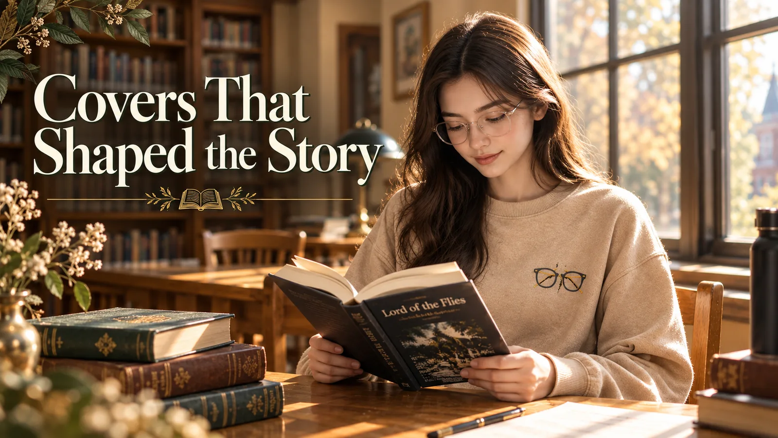
The cover you first read shapes the story you remember. William Golding’s Lord of the Flies has been repackaged dozens of times since 1954, and each edition makes a visual claim: some designers led with the island’s lush menace, others with a single symbol—the conch, the pig’s head, Piggy’s shattered glasses. If you’re hunting for a specific edition, building a collection, or choosing a gift for someone who quotes Ralph’s despair by heart, the cover matters. Not every edition is equal, and not every design honors what Golding actually wrote. Here’s what changed, what stuck, and which covers collectors and readers return to.
- Anthony Gross illustrated the original 1954 Faber edition with pen-and-ink tropical vegetation and outline figures in yellow and blue washes—a landscape-led design, not a single symbol.
- The 1964 Penguin Modern Classics edition by André François depicts the schoolboys beneath the shadow of their imagined monster, pairing innocence with dread.
- Jessica Hische's 2013 Penguin Drop Caps edition (ISBN 9780143124290) replaced illustration with typography, part of a 26-volume alphabet series designed with Paul Buckley.
- Faber's 70th-anniversary Deluxe Edition (November 2024, ISBN 9780571390762) centers Piggy's glasses on a contemporary hardback cover and includes Stephen King's introduction.
- Collectors prize first editions, but readers hunting thematic accuracy often turn to the Penguin Graphic Deluxe or Faber anniversary editions for covers that reflect the novel's symbols.
What did the original 1954 Lord of the Flies cover look like?
The original UK first edition, published by Faber and Faber in 1954, featured cover art by Anthony Gross: pen-and-ink drawings of tropical vegetation and outline figures of the boys, with yellow and blue washes extending across the jacket—a landscape-led design rather than a single symbolic image.
Anthony Gross’s jacket is the one Golding himself would have seen. According to The Letterpress Project, Gross used pen and ink to depict tropical foliage and the silhouettes of boys, layering yellow and blue washes across the entire jacket. It’s a landscape-first approach—evoking the island’s beauty and menace—rather than isolating a single object like the conch or pig’s head. The design reflects mid-century British book illustration: restrained, literary, and more interested in atmosphere than shock.
First editions with Gross’s dust jacket are rare and expensive, but even in reproduction the cover feels distinctly of its moment. If you’re teaching the novel or building a collection, understanding this original helps explain why later covers pivoted so hard toward single symbols: they were reacting against the subtlety Gross chose.
A true 1954 first edition in good condition with the Gross jacket can sell for £2,000–£5,000. Most readers are better served by the Faber 70th-anniversary reprint, which reproduces the original text and includes scholarly context.
How the 1964 Penguin Modern Classics edition changed everything
The 1964 Penguin Modern Classics edition, illustrated by André François, showed the schoolboys standing beneath the shadow of their imagined beast—a shift from landscape to psychological dread that influenced decades of covers to follow.
André François’s 1964 cover marked the moment Lord of the Flies became a symbol-driven story in the public imagination. According to the National Library of Scotland, François depicted the boys beneath the shadow of their imagined monster—a visual that named the novel’s central tension outright. The cover worked because it didn’t illustrate a scene; it illustrated a fear.
This edition became the template for a generation of school copies in the UK. If you read Lord of the Flies in a British classroom between 1965 and 1985, you likely held this one. The François cover is still in print in some markets, and used copies populate second-hand bookshops across the UK. For readers nostalgic for their first encounter with the novel, this is the cover that anchors the memory.
Typography over illustration: the Penguin Drop Caps series
Published in May 2013, the Penguin Drop Caps hardcover (ISBN 9780143124290) replaced pictorial covers with Jessica Hische’s typographic design, part of a 26-volume alphabet series created with Penguin art director Paul Buckley.
Jessica Hische’s cover for the Penguin Drop Caps edition doesn’t show the island, the boys, or any object from the plot. Instead, it leads with a large decorative initial L, rendered in Hische’s signature lettering style, and treats the novel as a piece of typographic architecture. The series spans 26 titles—one per letter—and the uniformity is the point: collect the alphabet, and the spines form a visual system.
This edition appeals to readers who want the novel on their shelf without broadcasting its darkness. The Drop Caps design is beautiful, but it sacrifices thematic clarity. If you’re buying for someone who connects deeply with Golding’s symbols—the conch, the glasses, the fire—this cover won’t speak to that. But if you’re furnishing a library or gifting someone who values design as much as narrative, the Drop Caps hardcover is one of the most elegant Lord of the Flies editions in print.

For the person whose shelves keep expanding—machine-embroidered lettering on a relaxed-fit crew.

The Penguin Graphic Deluxe Edition and Adams Carvalho's cover
Penguin’s US Graphic Deluxe Edition features cover art by Adams Carvalho and includes a foreword by Lois Lowry and introduction by Stephen King, making it a richly annotated choice for readers who want context alongside the text.
Announced in January 2017 on the official William Golding website, the Penguin Graphic Deluxe Edition pairs Adams Carvalho’s cover design with contributions from Lois Lowry and Stephen King. King’s introduction is especially valuable—he reads Golding as a writer of survival horror, and his perspective reshapes how you see the novel’s structure.
Carvalho’s cover leans into the novel’s visual iconography without being literal. The Graphic Deluxe series is known for its textured, tactile covers and deckle-edge pages, and this edition feels like an object worth keeping. It’s heavier and more expensive than a standard trade paperback, but for someone rereading the novel or teaching it, the King introduction alone justifies the price.
If you’re gifting the Graphic Deluxe Edition, consider pairing it with lord of the flies merch that reflects the novel’s symbols—embroidered designs pull directly from the text rather than generic “bookish” imagery.
Faber's 70th-anniversary edition: Piggy's glasses take center stage
Faber’s Deluxe Anniversary Edition, published November 7, 2024 (ISBN 9780571390762), places Piggy’s glasses at the center of a contemporary hardback cover and includes Stephen King’s introduction—a visual and editorial statement that intelligence and vulnerability are the story’s hinge.
Seventy years after Anthony Gross drew tropical foliage, Faber’s 2024 anniversary edition reduced the cover to a single object: Piggy’s broken glasses. It’s a bold choice. The glasses are the novel’s most fragile and most essential symbol—reason, clarity, fire—and centering them makes the cover a thesis. This edition also reprints Stephen King’s introduction, which frames Golding as a forerunner of modern survival horror and psychological thriller.
The Faber anniversary edition is the one to buy if you want a permanent, elegant copy for your own library. The production quality is high—sewn binding, thick paper, gilt edges—and the cover feels contemporary without being trendy. For readers who see Piggy as the novel’s moral center, this cover gets it right.
| Edition | Year | Cover focus | Best for |
|---|---|---|---|
| Penguin Drop Caps (Hische) | 2013 | Typography, decorative initial | Design collectors, uniform shelf display |
| Penguin Graphic Deluxe (Carvalho) | 2017 | Symbolic illustration, King intro | Readers who want literary context |
| Faber 70th Anniversary | 2024 | Piggy's glasses, gilt edges | Permanent library copy, thematic clarity |
Key modern editions compared
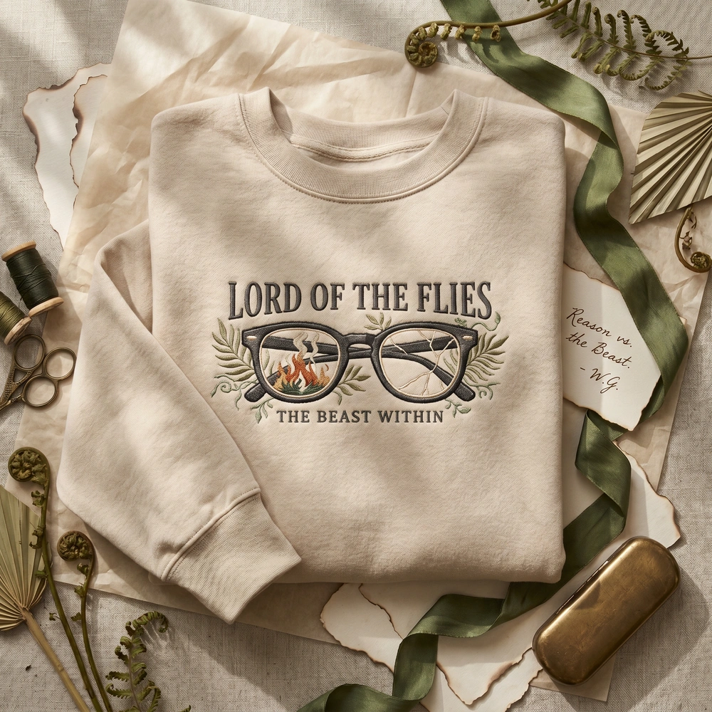
Machine-embroidered Piggy's shattered glasses on sand—a wearable nod to the novel's most devastating symbol.

Which edition should you actually buy?
For a permanent library copy, choose Faber’s 2024 70th-anniversary hardback; for annotated context, the Penguin Graphic Deluxe with King’s introduction; for shelf uniformity, the Penguin Drop Caps series.
If you’re buying for yourself and you reread, go with the Faber 2024 anniversary edition. It’s the most carefully produced, and the cover makes a clear thematic claim. If you’re teaching the novel or reading it for the first time and want guidance, the Penguin Graphic Deluxe gives you Lois Lowry and Stephen King alongside the text. If you collect design-forward editions or want a uniform series on your shelf, the Penguin Drop Caps hardcover is beautiful but thematically neutral.
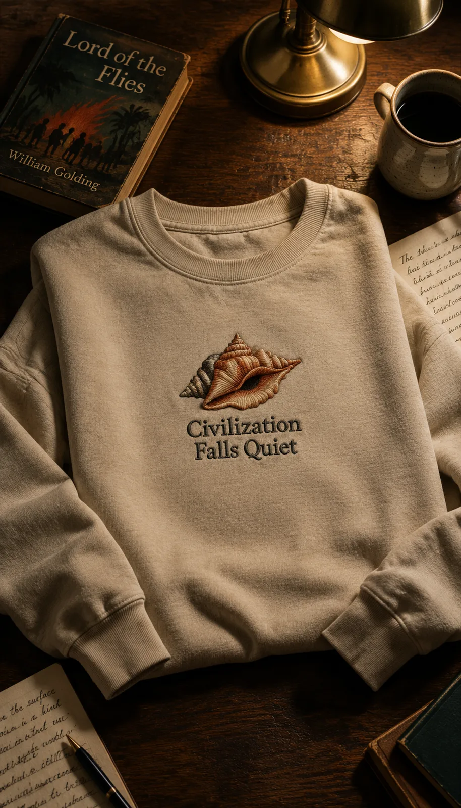
For younger readers or classroom use, a standard Penguin or Faber paperback is fine—focus on the text, not the cover. But if the book is a gift, the cover is part of the message. A reader who loves the conch as a symbol of fragile order will appreciate a sweatshirt that embroidered the conch more than generic “bookish” apparel, and the same logic applies to editions: match the cover to what they care about in the story.
- For collectors: Hunt for a 1954 first edition with the Anthony Gross jacket, or settle for the Faber anniversary reprint with scholarly apparatus.
- For rereaders: Faber 2024 hardback—gilt edges, sewn binding, Piggy’s glasses centered.
- For first-time readers: Penguin Graphic Deluxe with King’s introduction—context matters.
- For design lovers: Penguin Drop Caps—typographic elegance, no blood or symbolism on the cover.
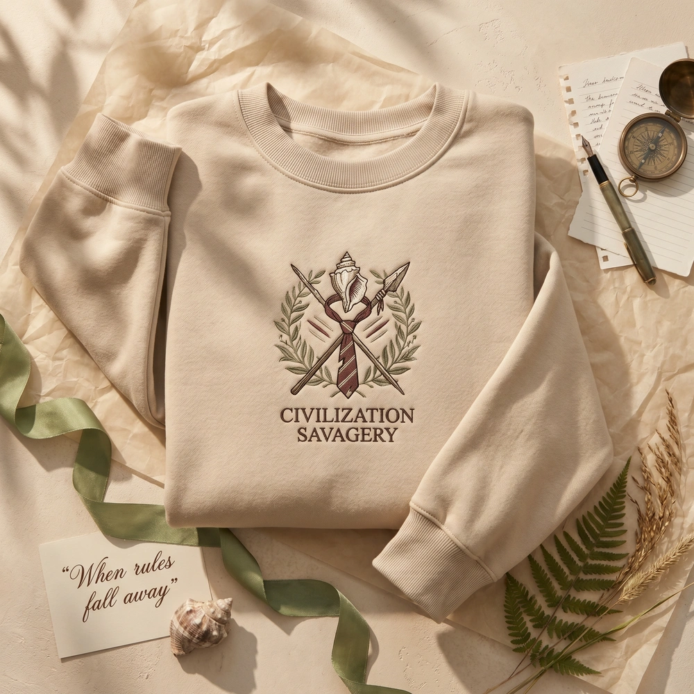
The island in thread—machine-embroidered palms and outline on sand, for readers who carry Golding's vision with them.
Why cover design matters for a novel like this
Because Lord of the Flies operates through symbols—the conch, the glasses, the beast, the fire—the cover you see first shapes which symbol you remember as central, and therefore how you interpret the novel’s argument about civilization and violence.
Golding built the novel as a system of objects, each carrying moral and political weight. The conch is democracy; the glasses are reason and technology; the pig’s head is the violence the boys project outward to avoid seeing it in themselves. When a cover designer chooses one symbol over another—or chooses landscape over symbol, or typography over image—they’re making an interpretive claim about what the novel is about.
The 1954 Gross cover, with its tropical vegetation and figures, emphasized the island as Eden turned savage. The 1964 François cover named the beast and the boys’ fear. The 2024 Faber cover centers Piggy’s glasses and argues that intelligence and vulnerability are the hinge on which the story turns. None of these readings is wrong, but they’re not the same reading. The cover is the first interpretive move a reader encounters, and it’s worth knowing which interpretation you’re walking into—or giving to someone else.
The cover you first see shapes the story you remember—each edition makes a visual claim about what Golding's novel means.— Design history analysis

Common questions
What is the rarest Lord of the Flies edition?
The 1954 UK first edition published by Faber and Faber with Anthony Gross's original dust jacket is the rarest and most valuable, often selling for £2,000–£5,000 in good condition. US first editions from Coward-McCann (1955) are also collectible but less iconic.
Which Lord of the Flies cover is used in schools?
In the UK, the 1964 Penguin Modern Classics edition illustrated by André François was the dominant school text for decades. In the US, schools typically use standard Penguin or Faber paperbacks with rotating cover designs—there's no single canonical school edition.
Does Stephen King's introduction appear in multiple editions?
Yes. Stephen King's introduction appears in both the Penguin Graphic Deluxe Edition (2017) and Faber's 70th-anniversary Deluxe Edition (2024). His reading frames Golding as a precursor to modern survival horror and psychological thriller.
Are any Lord of the Flies editions illustrated inside?
Most editions contain only text. The Penguin Graphic Deluxe and Faber anniversary editions include introductions and notes but no interior illustrations. Illustrated editions exist but are uncommon and typically aimed at younger readers or educational markets.